Data by Design
OVERVIEW
This digital book offers a new history of data visualization from the eighteenth century to the present.
Through a set of six interactive case studies, Data By Design will show how visualizations of data, like the data themselves, are never neutral informational forms. Rather, they always carry a set of implicit assumptions—and, at times, explicit arguments—about how knowledge is produced, and who is authorized to produce it.
ROLE
Lead Designer
SCOPE
Identity & Branding
Web Design & Development
TOOLS
figma
TailwindCSS
vue.js
TEAM
Studio Polymode
Lauren Klein
& The Digital Humanities Lab
DESIGN CHALLENGE
What is the story we tell about
the emergence of modern data visualization?
How might we tell that story differently?
![]()
![Poetic Research for the visual language and technical aesthetics of DataxDesign]()
![]()


Understanding the subtleties of the history of data viz—
and embracing a meta approach to storytelling. The team felt strongly about the project having features that document the process and data that went into pulling it together. My type decisions reflect a similar self-referential approach.
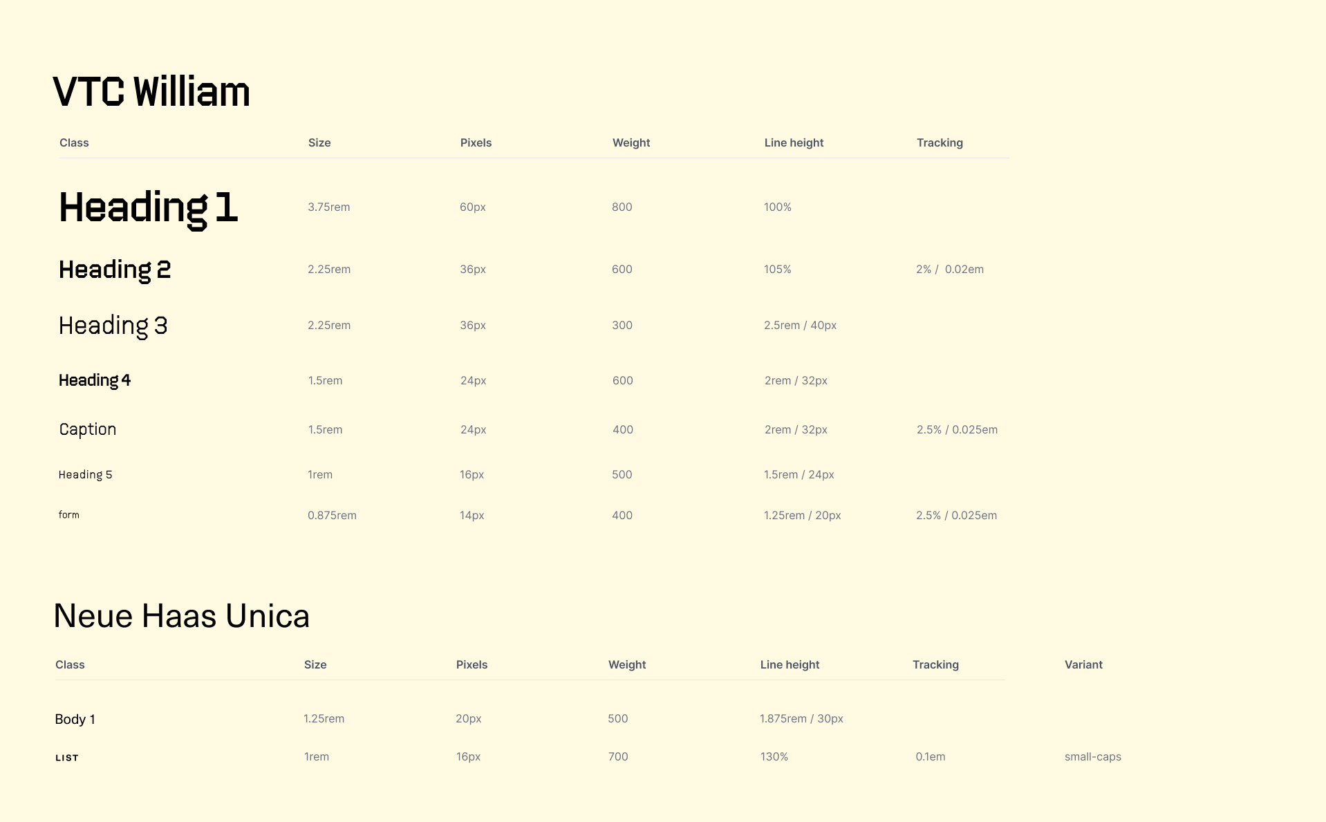
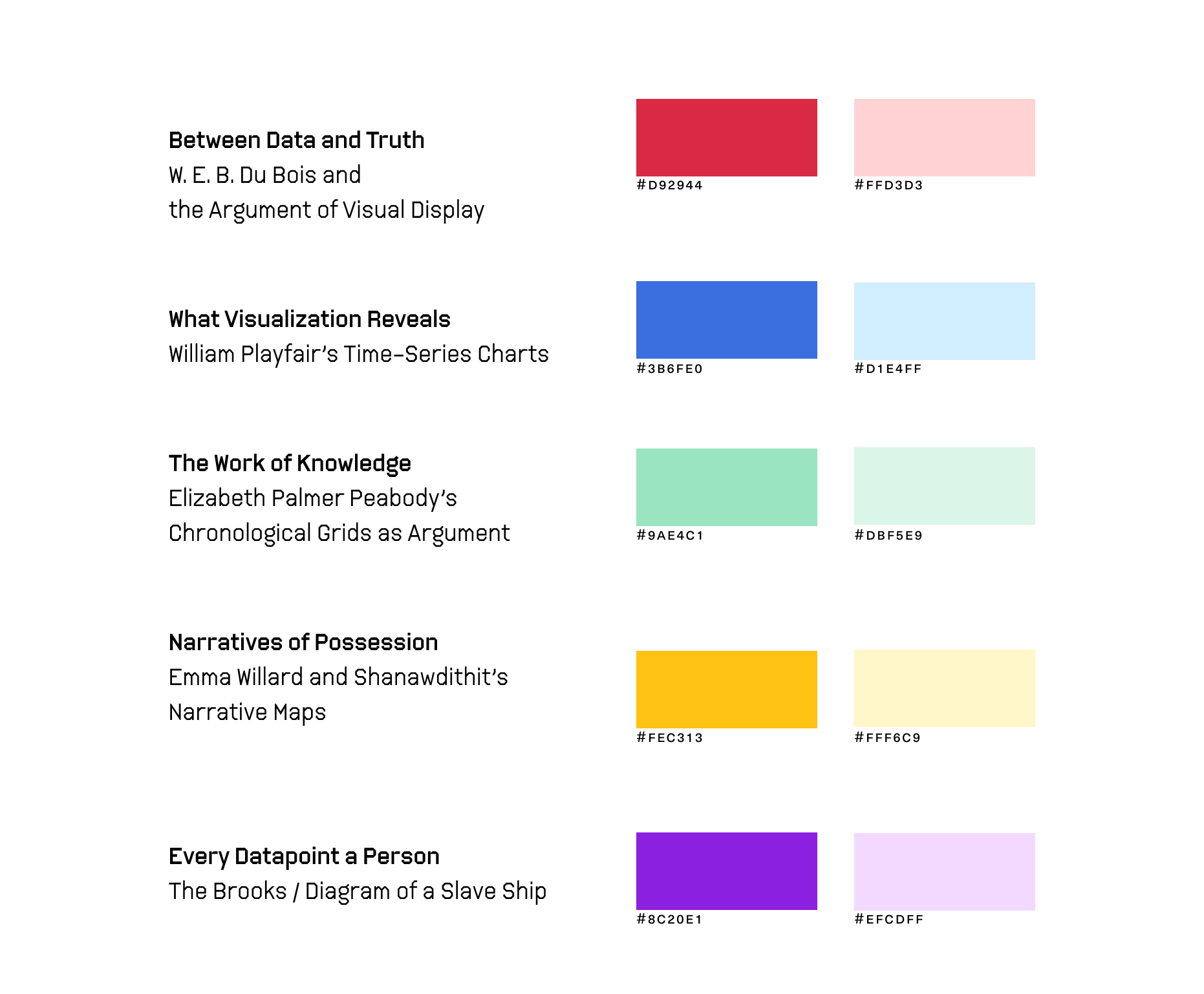
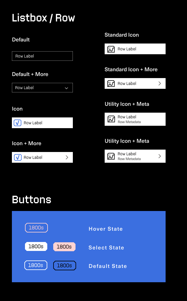
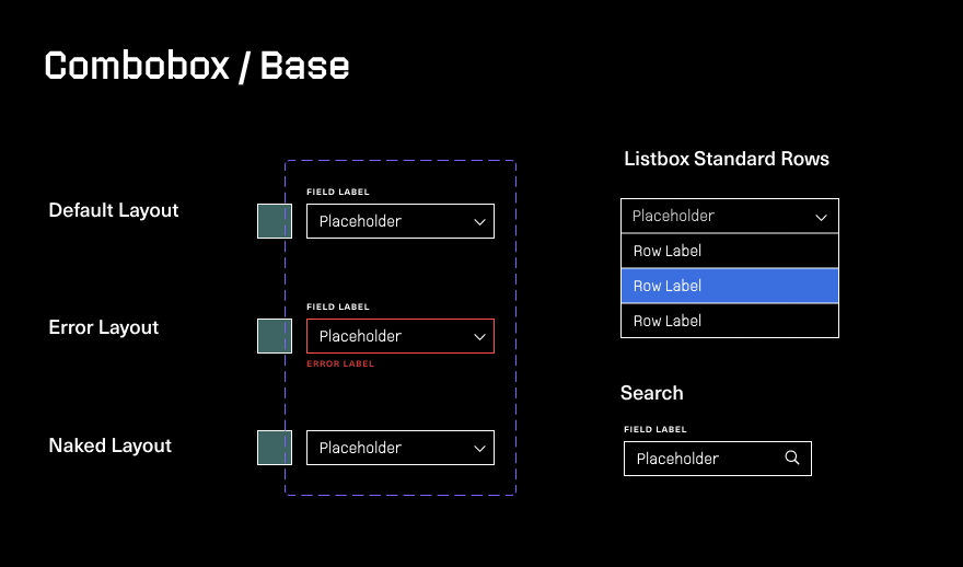
DESIGN SYSTEM
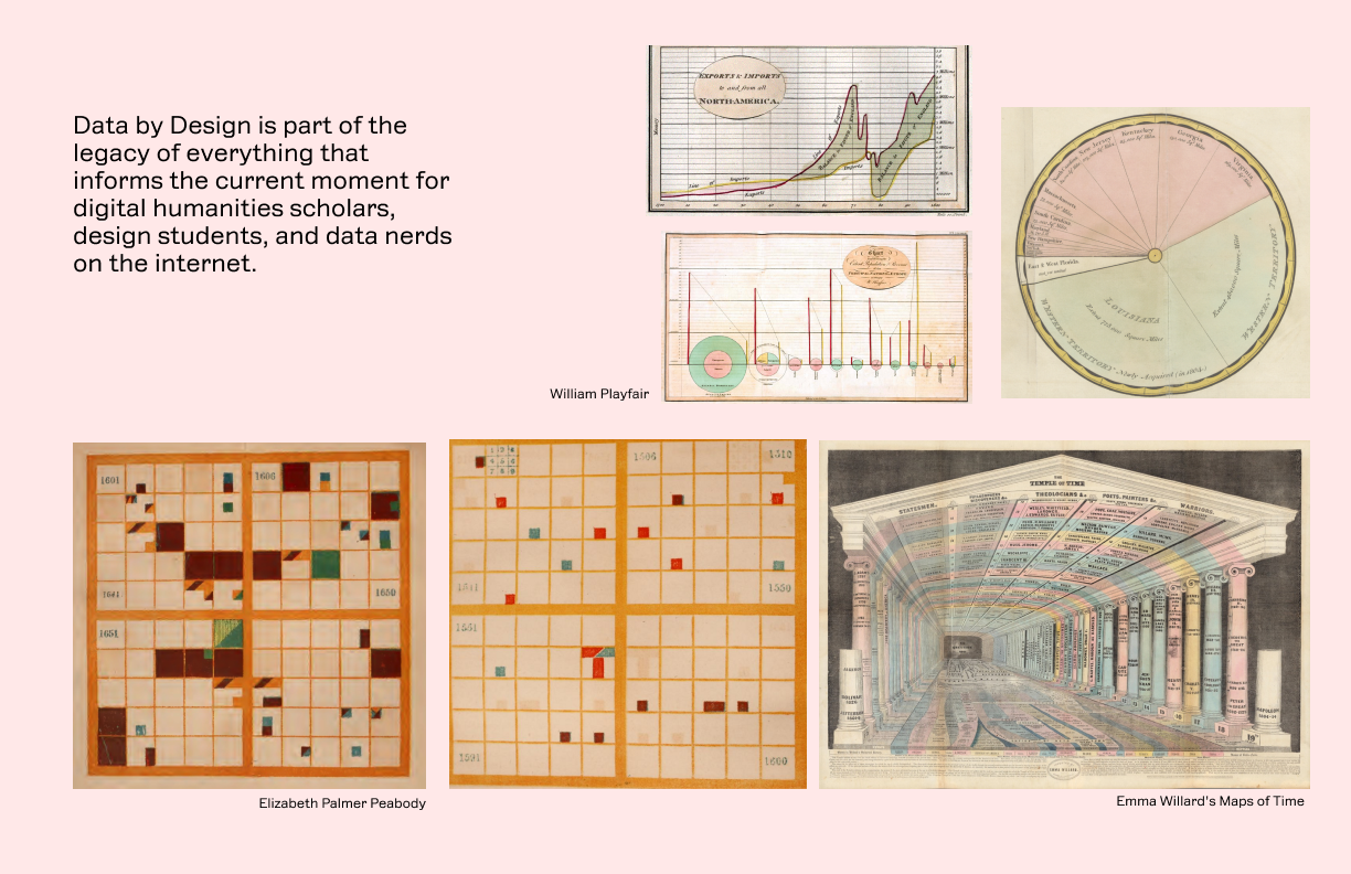
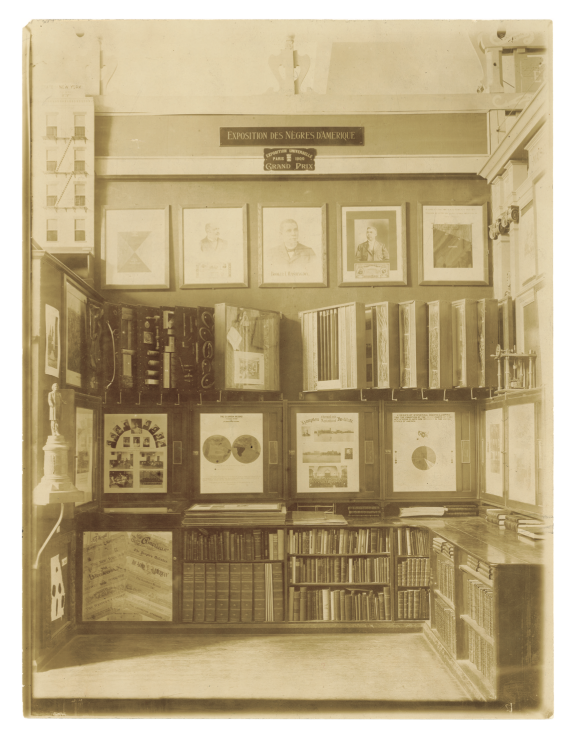
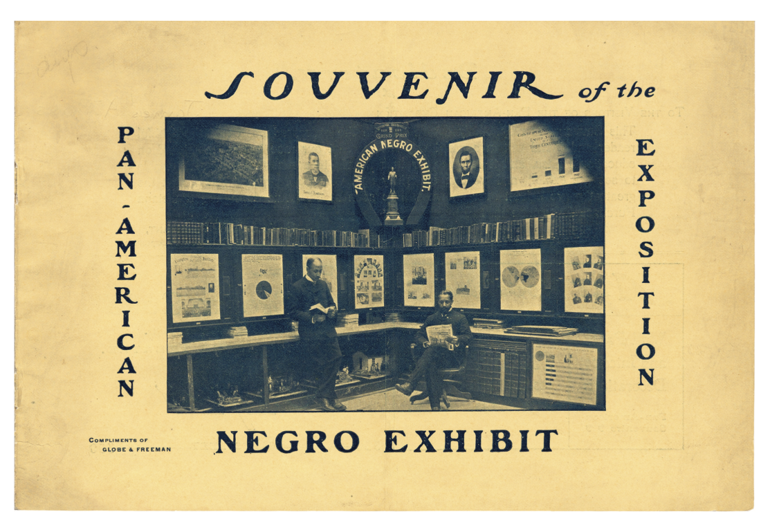
I developed a design language that is optimised for scalability. The components come together to form a site-wide system. The primary typeface, William by Vocal Type is a contemporary interpretation of a monoline engineering template-based lettering style that W. E. B. Du Bois and his Black students at Atlanta University used in their information design and experience design for the American Negro Exhibit in 1900 at the Exposition Universelle in Paris.
Addressing Stakeholder Priorities
Visualization as Evidence, Interaction as Argument
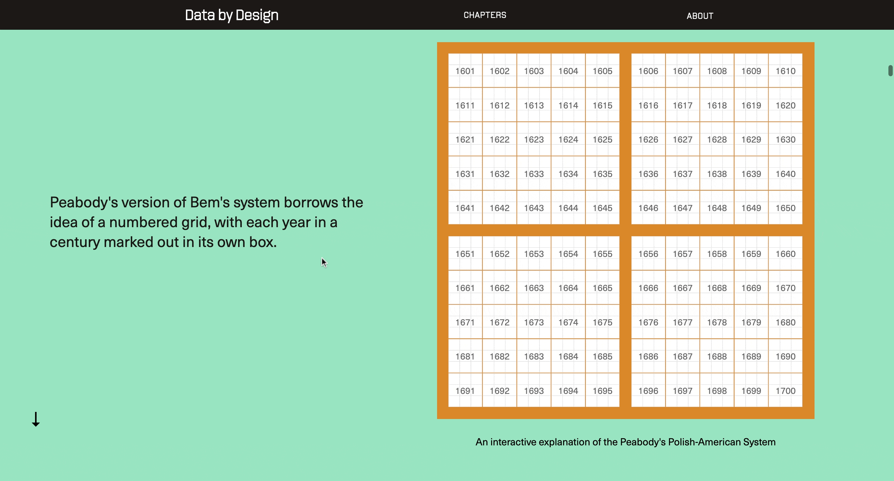
For the Paris Exposition, as the event is more commonly known, Du Bois worked with a team of Atlanta University students to create 63 poster-sized statistical charts. In this case, Du Bois sought to highlight the growth and progress of Black Americans in the years since emancipation.
The 63 charts created for the Paris Exhibition were grouped into two sets.
The first set, The Georgia Negro: A Sociological Study, focused on statistics that had been compiled by Du Bois and his students that related to the Black population of that state.
The second set was more national in scope. Entitled A Series of Statistical Charts Illustrating the Condition of the Descendants of Former Slaves Now in Residence in the United States of America, this set drew from several data sources, including the US Census, in order to put the Black population of the United States in national and international perspectives.


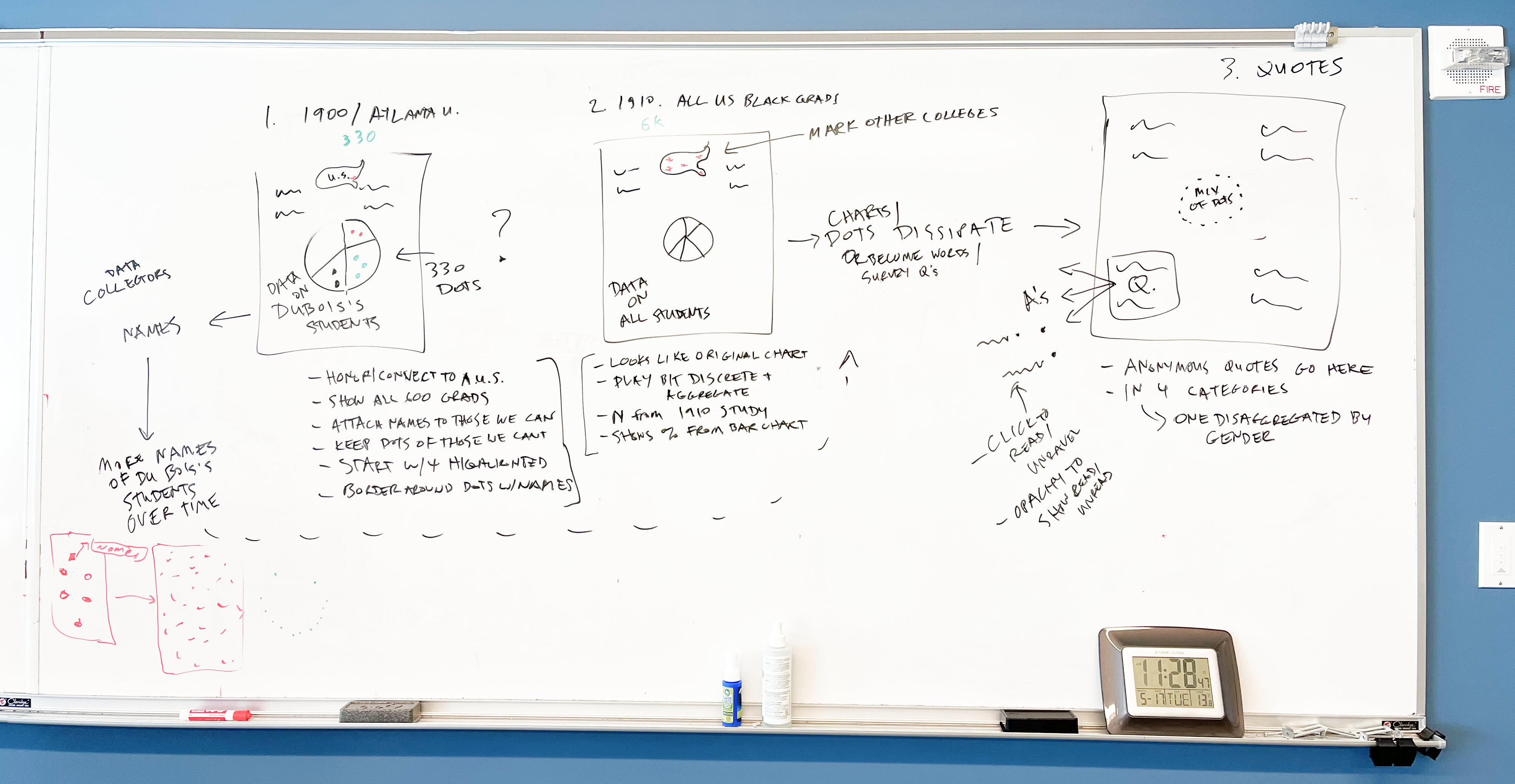
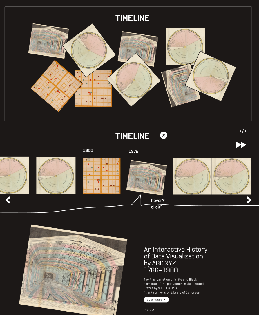
We wanted to preserve the 3 modalities DuBois engineered in the exhibit.
- the single frame
- the stack (w flipping)
- and the wall spread (to view everything in a set, all at once)

FINAL PROTOTYPE
We decided to pack information in a cornucopia of elemental interactions that leads the user parse through the charts in a set at their own pace, while providing a sense of the greater whole.
ADDRESSING FURTHER PAIN POINTS
Expandable inline footnotes that can be collapsed for a more compact view.
“I hate scrolling to the end of a document to find what the citation is. I lose track of where I was in the article, and how the footnote relates to the rhetoric cited.”
— Anonymous academic
OTHER INTERACTIONS
Scrollytell as progressive disclosure: