OVERVIEW
Preface is a product that connects the reader to the broader stakeholders of the reading experience. It allows for reviews and news to be populated in one space, instead of hosted on multiple websites.
SCOPE
User Research
Art Direction
Interaction
User Interface
Product
TOOLS
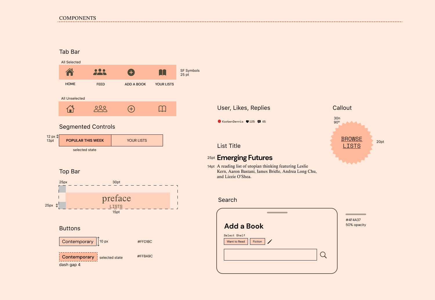
figma
KEY METHODOLOGY
Contextual Inquiry
User Requirements
MSCW+
Scope Analysis
User Research
Art Direction
Interaction
User Interface
Product
TOOLS
figma
KEY METHODOLOGY
Contextual Inquiry
User Requirements
MSCW+
Scope Analysis
Creating a centralised digital space to foster the reading community.
THE PROBLEM
Recommendations on goodreads and other magazines etc. are scattered, there is a lack of a more personal way of recording how someone feels about a book without being a comment lost at sea.
Recommendations on goodreads and other magazines etc. are scattered, there is a lack of a more personal way of recording how someone feels about a book without being a comment lost at sea.
APPROACH
This project revolves largely around addressing the grievances of the reading community and the different stakeholders that constitute it.
This project revolves largely around addressing the grievances of the reading community and the different stakeholders that constitute it.
DESIGN CHALLENGE
How might we build a centralised experience for those interested in cataloging and conversing around books?

Research
Understanding a reader’s social experience online.
After conducting research on existing platforms such as the product design at Goodreads and their user base, I decided to cater my product to addressing the pain points in the existing platforms.
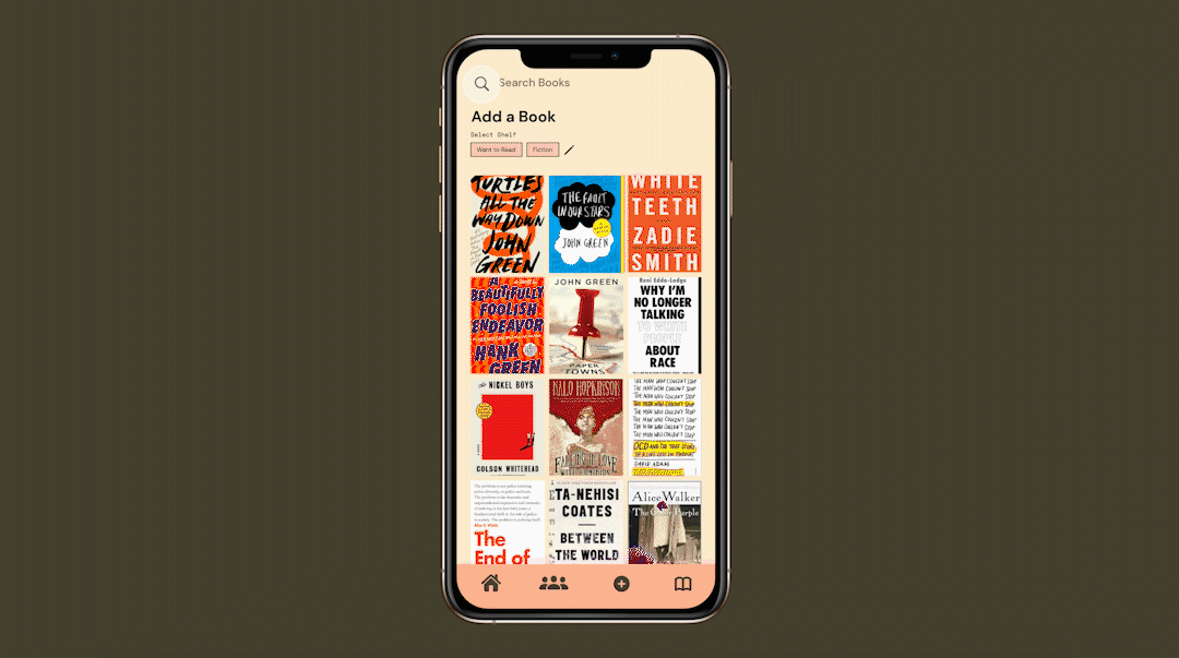
SOLUTION
Through an intuitive interface and data suggestions, people would be able to record books and add perform actions on found titles. Preface relies on the features that enable sharing and seeing how other users engage with books without being overwhelmed with reviews.
Through an intuitive interface and data suggestions, people would be able to record books and add perform actions on found titles. Preface relies on the features that enable sharing and seeing how other users engage with books without being overwhelmed with reviews.


Pain Points
Poor Community Engagement
- Difficult-to-understand and expensive promotion system, which privileges large publishers with huge budgets and makes it harder for indie authors and publishing houses to break through the noise.
- Reading Challenges do not encourage a positive or community oriented reading experience, reading is not a numbers game.
“I don’t want someone — or something — to dictate the way I read anymore”
- No way to control privacy settings for reviews.
Poor Interface
The text is small, and the interface features a copious amount of text which makes it difficult to navigate or know where to begin.
Tedious Process
Shelving seems like an afterthought, with no way or easily switching between shelves or dropping books.

INSIGHTS
I focused my initial iterations on addressing organically finding and logging books, and developing the social networking faculties that encourage readers to keep reading.
I focused my initial iterations on addressing organically finding and logging books, and developing the social networking faculties that encourage readers to keep reading.
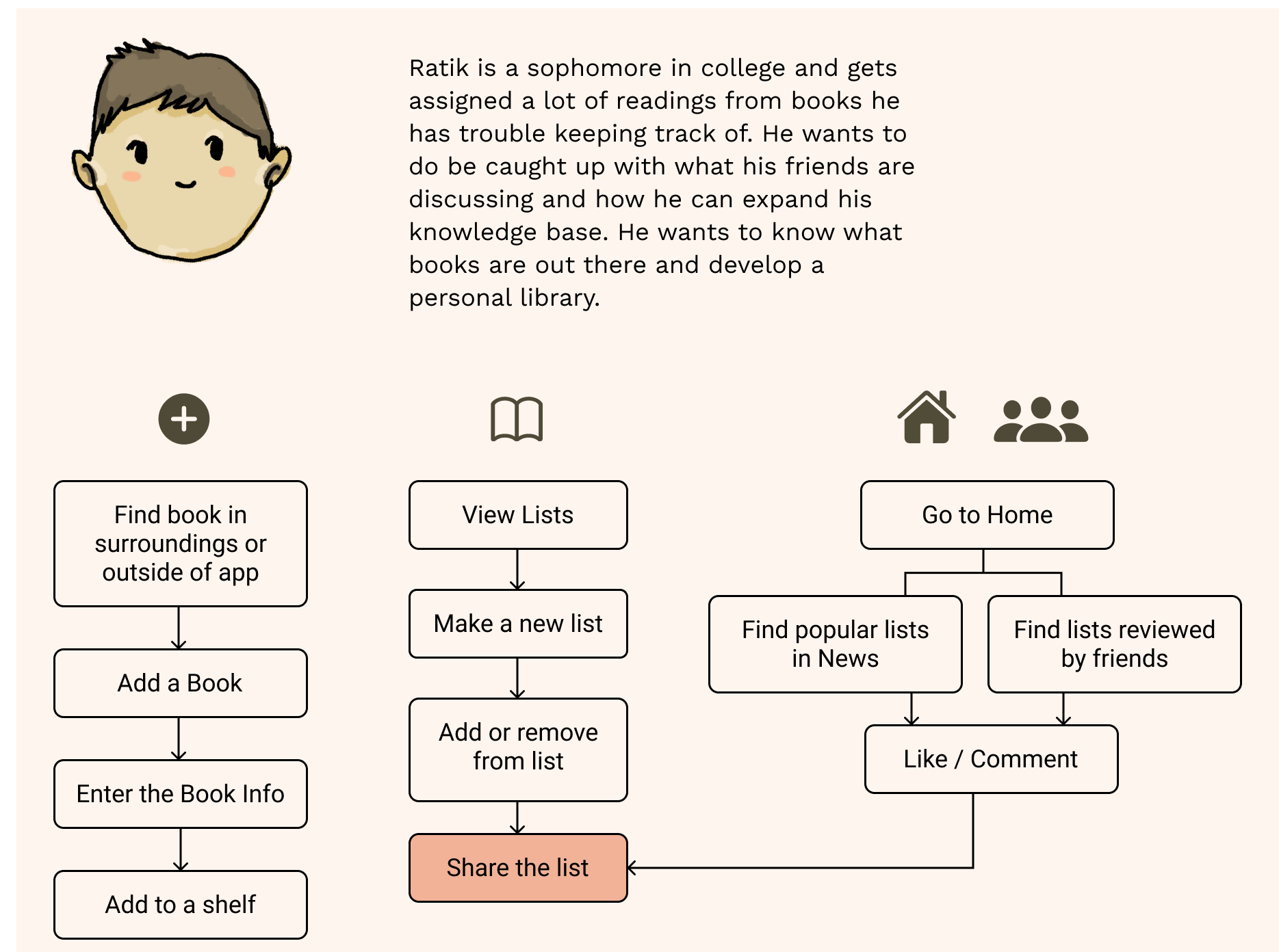
Persona Scenario
After establishing our design strategies and user needs, I outlined what a typical user journey would look lik. From here, we started to ask ourselves some important questions not only about what an ideal user flow would be but what is the scope of the problem that I’m looking to address intially.
- At what points can a user add books that they find?
- Where are the areas that expose the use to new books to peruse?
- How should the user be able to organise their content?
PROTOTYPING
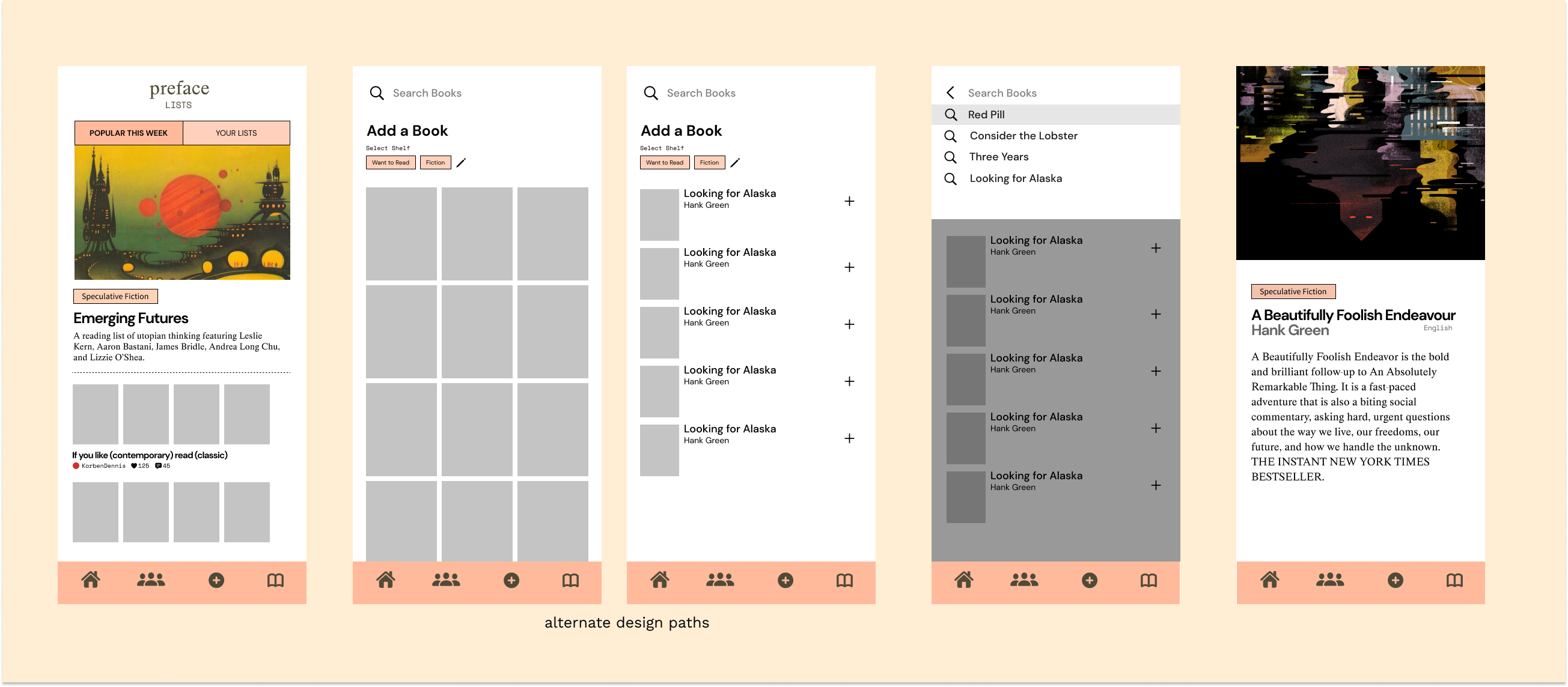
Wireframe Flow
As I sketched out wireframes for the usecases, I started creating low fidelity prototypes. I researched the common patterns that users may be used to for various features and actions.


FINAL THOUGHTS
What I learned
I personally have trouble keeping up with reading lists. My changes are an attempt to make the platform a more visually engaging and holistic experience.
I started this redesign with the intent of addressing the user pain points, and quickly realised that one of the biggest shortcomings of Goodreads is it’s aesthetics. I used this as an opportunity to explore reinventing the visual elements and branding of an existing product alongside it’s user experience.
What’s next?
I want to continue addressing the pain points in the user experience and prototype it the solutions. This has been a challenging project in terms of its scope, and it has been constructive to understand where the shortcomings in my own process are.
